


A brand becomes unforgettable when every part tells the same clear story. That story should be simple to grasp, easy to spot in the wild, and flexible enough to show up well in any channel. When teams rally around this shared idea, the design feels confident, and the experience stays consistent.
Strong brands respect the people who use them. They are readable, accessible, and built to include more users. With a few core principles, you can shape a design system that is memorable today and durable tomorrow.
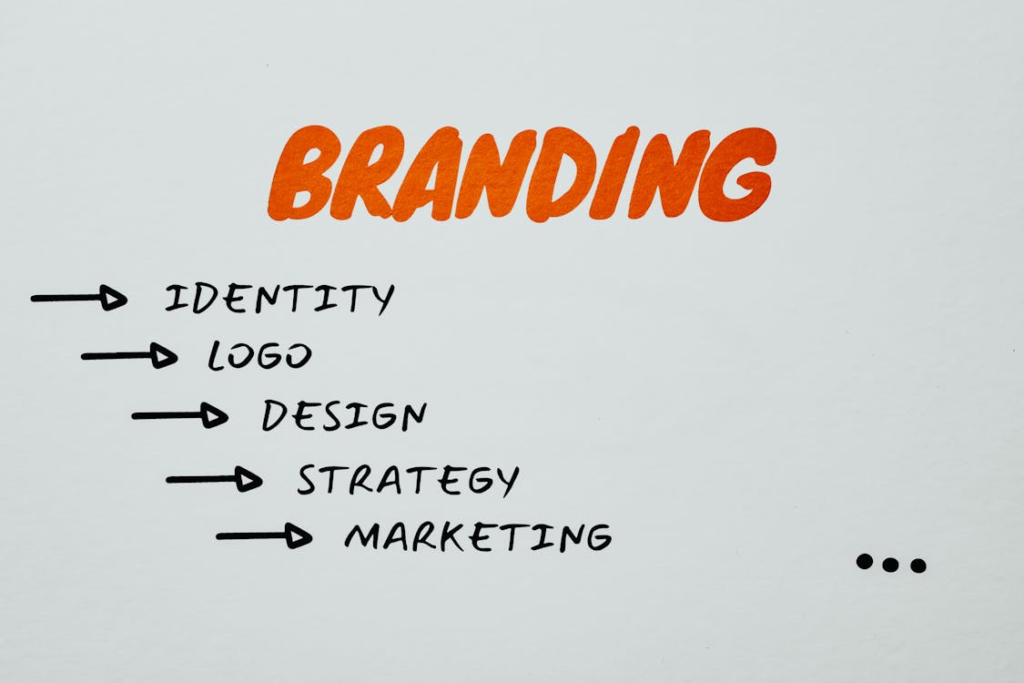
Clarity Starts With A Simple Idea
A memorable brand starts with reduction. Strip the idea down to a symbol, wordmark, or motif that carries meaning without extra detail. Clarity beats clever when your audience has only a second to notice you.
Academic research has found that simpler logos can shift how people read a brand’s personality. One recent study noted that simple marks tend to increase perceived competence, while complex ones may lean toward warmth. Use this insight to choose the right level of detail for how you want to be seen.
Simplicity pays off in small sizes and busy feeds. A crisp shape reads on a fav icon, a cap, or a street poster. If your idea fails at 16 pixels, it will fail on a crowded sidewalk.
Codify Consistency With Brand Guidelines
Guidelines are the rails that keep creativity on track. They capture the core idea, then show how to apply it to color, type, spacing, voice, and imagery. Done right, they save time and reduce guesswork across teams.
Document what goes where, who uses what, and where to find it. Start with a single source of truth at redkite.design or similar resources to keep teams aligned. Place downloadable assets next to clear do-this-not-that examples. Make it easy for partners to get it right the first time.
Industry playbooks show why this matters. One established organization explains that cohesive brand rules protect recognition and keep every touchpoint working together. Consistency is not red tape. It is brand equity insurance.
Design For Accessibility From Day One
Accessibility is not a final coat of paint. It is a design input as early as color choice and type size. Aim for legible contrasts, readable line lengths, labeled controls, and meaningful alt text.
The web still struggles here. A large annual scan of home pages in 2024 reported that most sites had detectable WCAG 2 issues, which means many users hit avoidable barriers. Treat that statistic as a call to design for more people, not fewer.
Bake checks into the workflow. Test contrast as you pick colors. Review focus states as you lay out components. Write alt text while you export images. Small habits prevent large rework.
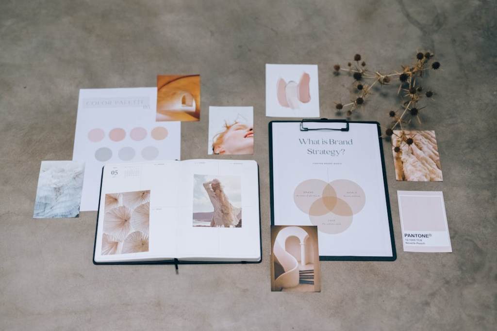
Color And Typography That Work Hard
Color should carry both recognition and function. Choose a lean palette with roles for primary, secondary, accent, and states. Define how colors pair for backgrounds, text, and interactive elements, so designers do not guess.
Typography gives the brand its voice on the page. Pick a type system that reads well on mobile and print, and define sizes, weights, and spacing tokens. Resist novelty that hurts legibility. The right font choice fades into the background and lets the message land.
Test your palette and type together across real content. Headlines, captions, buttons, and error messages reveal weak spots fast. If you cannot read it at arm’s length, it is not ready.
Build Distinctive Assets You Can Repeat
Distinctive assets are the shortcuts to memory. Think signature shapes, motion patterns, photo treatments, or a sonic cue. These are the pieces users can spot before they read a word.
Make each asset simple enough to draw from memory. A corner radius, a grid rhythm, or a curved notch can become a practical thread across products and ads. When these cues repeat, the brand feels familiar in new contexts.
Use repetition with restraint. Overusing one trick can feel loud. Instead, create a small set of assets and rotate them thoughtfully so the system never goes flat.
Test, Measure, And Evolve
Treat the brand as a product. Put designs in front of users early, and look for signals in both qual and quant data. What gets noticed, what gets misunderstood, and what gets ignored will guide the next iteration.
Create a simple measurement loop across channels. Track recall, task success, and accessibility feedback, then tie those findings back to design decisions. Share wins and misses so everyone learns together.
Use a regular brand health check to keep momentum:
- Run a quarterly audit of key pages and assets
- Refresh the guidelines with real examples from the last campaign
- Retire dated elements and promote the patterns that perform

A brand becomes unforgettable when it is simple, consistent, and accessible in every place it appears. Keep the core idea tight, let the system do the heavy lifting, and protect usability as a first rule. Small choices add up fast, and they shape how people remember you.
Stay curious and keep improving the work. Run audits, listen to users, and refine the patterns that prove themselves. When your team treats brand design as a living system – not a one-time project – recognition grows and trust follows.


We create powerful, insightful content that fuels the minds of entrepreneurs and business owners, inspiring them to innovate, grow, and succeed.